Category Archives: Coppock Curve

Coppock Curve: July 2012

The Coppock Curve is one of the technical indicators that we focus on for long-term buying signals. The Coppock Curve is only useful as a BUY indicator when the chart goes from positive territory to the negative territory and then starts to turn decidedly upwards. As previously indicated, the Coppock Curve does not provide SELL signals in any way.

Once the signal starts to turn up, investors should consider buying stocks at the beginning of the month after the indicator turns upward. Our last "buy" indication came at the end of April 2009. Anyone who purchased the Dow Jones Industrial ETF (DIA) on the first trading day of May 2009, they would have gained +59% in the process.

After July 2012, the Coppock Curve remains far from the negative zone. This suggests that, overall, the market is not considered a "buy."

More about the Coppock Curve.

Market Review and Analysis

As the Dow Jones Industrial Average (DIA) approaches the 12,000 level, we believe it is necessary to review our analysis leading up to this point. There have been indications that the market would knock on the door of 12,000. And we’ve been at the forefront of this analysis very early on.
Starting as early as February 12, 2009 (article here), we warned that despite the declining trend in the markets, history has proven that declines of 40% or more tend to retrace 60% to 100% of the previous decline.
In September 2009, after reviewing the Coppock Curve (article here), we pointed out that if the market held up in October 2009 that 12,000 on the Dow would not be an unrealistic price target.
In January 2010, we mistakenly thought that the Dow had a good chance to reach 12,000 by February 2010 (article here). Although we were woefully inaccurate in the timing of our estimate, we were convinced that 12,000 as an upside target was not unreasonable.
On March 23, 2010, we came out with an article that highlighted what we thought was confirmation of a cycle low in the market on February 8th (article here). In retrospect, although it was a major low for the year 2010, it was not as significant as the July 2010 low. However, we reiterated 12,000 as the target for the Dow.
Our eyes are now trained on the next target for the market. This is where our “analysis” is put to the test. All along we’ve thought that a rise from 6,400 to 12,000 would not be very unusual. However, getting back to even, or 14,164, will be very challenging. There are many who feel that external forces have falsified the markets rise.
As far as we’re concerned, we’ve accomplished the target that was long since projected and is now upon us. As we’ve indicated in a recent article, the Dow Industrials’ upward trend has less to do with the actions of the Federal Reserve and more to do with the corrective nature of markets after a significant plunge like in the period from October 2007 to March 2009 (article here).
We’ve noted in the article titled “Diversification Doesn’t Matter” that declines in the Dow will be amplified in the S&P 500 and Nasdaq Composite Index (article here). Exposure to these diversified indexes through the use of index funds and ETFs will result in surprising losses that defy the theory of diversification as was the case in 2008.
We believe that as long as the price of gold keeps moving higher in conjunction with the Philadelphia Gold and Silver Index (XAU) and Dow Theory confirmations of the bullish trend continue, there is a good chance that the market will retrace 100% of the previous decline from 2007 to 2009. At times like these, the rise and fall of the price of gold may be a leading indicator for where the market might be headed. Our numerous articles on the correlation between gold and the stock market have proven to be correct for those willing to accept the data from an unemotional standpoint (article link).
Although it is not unusual for markets to retrace 100% of a prior decline of 40% or more, we’re more than willing to figuratively step aside and watch what happens next. However, we cannot help taking another stab at when, and not at what exact level, the Dow Industrials will peak. Two prior articles on the topic are the basis for our thoughts on the prospects for where the top may occur.
On June 14, 2010, we wrote an article titled, “A Market Cycle Worth Observing” (article here). In that article, we reminded readers of the consistency of 4-year cycles to provide key markers for tops and bottoms in the market. We included referenced from Charles H. Dow’s era, founder of the Wall Street Journal, from 1901 and prior. We gave examples as provide by Richard Russell from 1953 to 1979. We were even able to provide examples from the period between 1987 and 2009.
If there really are 4-year cycles, as we contend, then October 2007 would stand as the marker for the last peak in the cycle. In theory, the mid-point for the peak would be some point in 2009. For us, March 9, 2009 represents the low or mid-point for the 4-year cycle. Our estimate is that the full 4-year cycle should be completed with the Dow Jones Industrial Average peaking at some point in 2011.
According to Dow Theory, the downside target is set at 9,273.50. If this level is breached in conjunction with the Dow Transports, then we could consider a bear market has been initiated.
The second article that we derived our view of the market is dated April 11, 2010 on the topic of Dow Theory (located here). In that market analysis, we proposed, in addition to the fact that the Dow Industrials “…could go to 11,574.59 with no problem,” we outlined three hypothetical scenarios under which the Dow Industrials would reach 14,164.
In retrospect, and upon further analysis, we realized that those projections were really indications for when the market would top irrespective of the exact level that the top would occur. It seems to us that the period from January 31, 2011 to June 18, 2011 is the timeframe for when the completion of the cycle should take place.
Despite our concerns for an eminent top in the market, we will continue to buy and sell individual stocks. From our experience in 2008, gains can be obtained from individual stocks within the context of a declining trend in the market. In fact, during 2008 there were only three months where losses were registered which were June, October and November. Although these months incurred substantial losses, 2008 ended with overall gains of 14% in our portfolio (article link).


Please revisit New Low Observer for edits and revisions to this post. Email us.

Coppock Curve Q & A

A reader asks:
"Isn't it possible to determine good times to sell stocks using the Coppock Curve?"
Touc's reply:
My understanding of the Coppock Curve is that it is strictly for the purpose of giving buy signals. Sell signals are purely coincidental if they occur at all.
Drawing from Mr. Coppock's own words in Barron's October 15, 1962 article, Mr. Coppock states that,"It [Coppock Curve] gives a so-called buy signal."(page 5) Mr. Coppock goes even further to state that, "Because well-timed buying is far more difficult for the nonprofessional investor than timely selling, it is best to think of the curve as a very long-term buying guide. Its formula was devised for that type of use." (page 5,16)

In James Dines' book Technical Analysis (page 377, 1972), there is no mention of the Coppock Curve as being able to provide a sell signal or eminent market slumps. Any mention of the Coppock Curve was with the ability of the Curve to "pinpoint the start of new trends and enable investors to select future market leaders." (page 378)
There seems to be no evidence that would suggest that the Coppock Curve should be used to determine potential declines. Instead, the Curve should only be tested on its ability to accurately call the bottom in a given stock or index.
Best regards.
Email our team here.

Market Checkup: Coppock Curve

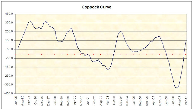
It's been quite some time since we made an update to the Coppock Curve. The curve or index moved into positive territory in January 2010. Let me remind you that the Coppock Curve is only a buying indicator and tells us nothing about selling. For an indicator to become bullish, the curve has to be in a negative territory and turning upward. I indicated that the bullish indicator came in May 2009 when the index rose from -386 to -380. Table below shows the March low (2009) up until now.

Date Index
Mar-09 -374.4
Apr-09 -386.0
May-09 -380.5
Jun-09 -376.5
Jul-09 -357.8
Aug-09 -319.1
Sep-09 -265.3
Oct-09 -212.7
Nov-09 -147.3
Dec-09 -61.7
Jan-10 25.1
Feb-10 95.0
Mar-10 168.0

The chart below shows that we are clearly in the positive territory. This leave us with one thing, for the curve to turn negative and reverse for a possible buy signal.

If this curve isn't an indication to sell, then why am I writing about this? Because I believe that it is a great tool for long-term investors and they should be aware of this unique indicator. When the index turned  upward in May 09', many small investors, myself included, were still bearish on the market and ignored this technical indicator. Emotions and anger about the bailout clouded our judgment. As a result, many missed the chance to buy the market via ETFs or mutual funds. Even though I was bearish, I stated in that article "This could be the beginning of a greatest investment opportunity if you look in the right place. I suggest you begin accumulating shares but with caution!"

The good news is that some time in the future, this curve will turn negative again. We'll be more excited when that happens. The bad news is, we just don't know when this will happen. Until then, do your research on the Coppock Curve to see if this indicator can be of any benefit to your investment strategy. We will keep an updated chart on the curve and update you when an opportune time arrives.

Click here for more explanation on the Coppock Curve and here for the calculation method. - Art

Quote of the day:

"To know values is to know the meaning of the market. And values, when applied to stocks, are determined in the end by the dividend yield." Charles H. Dow.
Email our team here.

Investment Observation: ExxonMobil (XOM) at $65.90

The next and most anticipated investment observation is ExxonMobil (XOM). XOM has been on our new low watch list since October 30, 2009. According to Mergent’s, XOM has increased its dividend 26 years in a row. XOM is described by Yahoo!Quotes.com as “Exxon Mobil Corporation engages in the exploration, production, transportation, and sale of crude oil and natural gas.”
The biggest item regarding this company is the fact that the Coppock Curve is signaling, or is about to signal, an all clear for the purchase of XOM stock. In the chart below, you can see the unique buy signal that is given whenever the stock goes into negative territory and then turns upward. Not until the signal crosses from negative to positive does it indicate the best opportunity to buy XOM.
On the following five occasions, XOM turned decidedly higher:
  • September 1974 up 207% in 2 years
  • January 1978 up 194% in 2 years 10 months
  • March 1982 up 491% in 11 years 1 month
  • June 1994 up 333% in 6 years 6 months
  • February 2003 up 279% in 4 years 8 months
On average, it took 5 years and 3 months to reach the peak in the stock price before a major decline. The worst price decline immediately after the Coppock Curve buy signal was 11% in 1982.
According to Value Line dated June 27, 1997, XOM normally traded at a mean price of 10 times cash flow. In the most recent Value Line dated December 11, 2009, XOM is expected to trade at 8 times cash flow. XOM had a cash flow of $11.58 per share in 2008 and an estimated cash flow of $6.50 for all of 2009. Using the lower cash flow estimate for 2009, XOM is expected to be fairly valued at $52 per share. This is despite the fact that Value Line has a higher cash flow per share for 2010 of $8.45 per share.
Working in favor of XOM is the fact that the company has decreased the number of shares outstanding from 6.9 billion in 1999 down to 4.75 billion at the end of 2009. XOM has gone down a separate path of other companies that borrow in order to lower the number of shares outstanding. Debt remains a small part of XOM’s balance sheet.
One of the most significant elements of the downside risk to this company is the fact that, to this point, we’re in secular bear market. This means that the market could turn down at a moments notice. Therefore, I will use the Dow Theory downside targets based on the price increase from the low of $33.23 in February 2003 to the high of $95.05 accomplished October 2007. The Dow Theory downside targets are:
  • $64.14 (fair value)
  • $53.83
  • $33.23
It remains to be seen how much XOM continues to fall. However, based on the prior Coppock Curve indications, XOM is expected to remain unchanged or fall for another three to six months by about 11% to 18%. However, if you’re willing to buck the trend of the overall market, this stock will make for a great 3 to 6 year holding. Get your research in before the upcoming dividend payment and good luck.

If we were to invest in stocks the way that Charles H. Dow would then we would buy half of the intended amount now and purchase the second half if the price declines. For example, let's say that you wanted to invest $13,180 in this company. What you would do is buy $6,590 worth of stock now (approximately 100 shares) and hold the stock if the price goes up. If the stock goes down then you would invest the remaining $6,590 at the next level that you felt was ideal. This approach works well regardless of the market that you're in as long as you set aside the amount that you intend to invest before making the first purchase. Also, after making the first investment never invest the second half somewhere else.
The purpose of my research recommendations is to point out quality Dividend Achievers that have reached a new 52-week low. From this point begins the research to verify the quality of the stock for both short and long-term investing. These recommendations are within the context of the 3rd year of an 18-year secular bear market. A bear market that I expect to trade in a range between 16,000 and 5,000.

-Touc

Speculative Observation: Cephalon Inc. (CEPH) at $62.42

The new year brings new challenges and opportunities. The first opportunity for this year may come from Cephalon (CEPH) which engages in the discovery, development, and commercialization of products for central nervous system, inflammatory disease, pain, and oncology therapeutic areas. It competes against GlaxoSmithKline plc (GSK), Johnson & Johnson (JNJ), and Sepracor Inc. Because the company doesn't pay a dividend, the New Low Observer team has to classify such a security as a speculation.

CEPH came onto our radar when we began compiling the new low data back in July when the stock was trading around $57. This was 8% above the 52 week low of $52.55. At the low, CEPH was trading at less than 15 times earnings. Although appearing to be risky, selected stocks at or near their low offer investors the opportunity to investigate quality companies for potential price increases. Our concept is laid out in the "Buy Low, Sell High" article.

CEPH has a market cap of $4.6 billion dollar. The relatively small size compared to its rivals doesn't discourage us. We only care about the market cap as a means for liquidity when buying and selling the stock. CEPH earned $3.62 per share over the last 12 months and thus has a price to earnings ratio (P/E) of 17 and a forward P/E of 10, an extraordinarily low multiple. Low P/E multiples imply that investors are paying less for every dollar of earnings (more on our view of P/E). CEPH has a book value of $28.71 per share. At $62, price-to-book is north of 2. A positive operating cash flow of $232.48M is a plus but a negative free cash flow is one of my concern ($-12.71M).

Fundamentals aside, the stock may have discounted all the negative news based on the chart pattern. In 2009, Cephalon dropped 19% as opposed to the Dow Industrials which rose 19%. Unlike the Dow which hit the yearly low in March, Cephalon bottomed in July and formed what appears to be a base. This pattern is prominent because it shows that the stock failed to move either up or down and traded in range between $60 and $53. Any break above $60 or below $53 will reveal its potential direction of the stock. Sure enough, the stock broke above $60 in late December and will look for that to be a support for the stock. The momentum indication also turned bullish as the 50-day moving average crossed the upward sloping 150-day moving average as indicated in the chart below.

Another indicator I like to refer to is the Coppock Curve (click here for more on the Coppock Curve). For Cephalon, the curve dates back to 1993. The table below shows my findings.

Date Price 3 Mo After % Change
May-95 9.81 24.25 147%
Feb-98 12.00 10.63 -11%
Sep-98 7.31 9.00 23%
Mar-99 8.75 17.38 99%
May-03 45.16 44.35 -2%
Sep-05 46.42 64.74 39%
Aug-08 76.62 73.48 -4%

The average percentage gain if you sell three months after the buy indication is 42%. Excluding the 1995 data, it is 24%. We are waiting for the indicator to turn for a possible buy signal.

A buy strategy would be to purchase this stock as close as possible to $60 or the 50 day moving average which is dynamic and constantly changing. Use the Coppock indicator as another gauge to buy and watch your gains or losses closely. - Art

Coppock Curve Review

"Too much too soon." Those are the words of E.S.C. Coppock in describing the emotional state of the uninitiated investors response to the ups and downs of the stock market. The purpose of the Coppock Curve is to measure the emotional overreaction to the movement of the stock market.

Mr. Coppock observed that investors tend to ignore the fact that earnings are stable or rising and instead sell off a stock which is thought to be in trouble. Therefore, the monthly averaging of an index like the Dow Jones Industrials allows for better clarification of the what the price action is telling us.

So far the Coppock curve is indicating that, although we may not be at the bottom in the stock market, we are still in a relatively risk free period to invest in stocks. The following is the movement of the index from the lowest point since April 2009:

  • Apr 2009: -388
  • May 2009: -383
  • Jun 2009: -378
  • Jul 2009: -359
  • Aug 2009: -321

With the Coppock Curve indicating that we're at a relatively risk free period for stocks along with the Industrial Production Index moving up and the Dow Theory bull market indication of July 23rd, it appears that we could be on our way to higher levels in the stock market and the economy over an extended period of time. Dow Theory still has a pending non-confirmation to be worked through but I will not report on that until we get a resolute signal. Touc.

related articles:

Please revisit Dividend Inc. for editing and revisions to this post.

Coppock Curve Review

Today is the end of the month which means that we can now review the Coppock Curve(also known as the Coppock Index) to determine if the direction for stocks is indicated to be moving higher overall. Since the last bottom in the Coppock Curve back in April the index has had the following monthly figures:

  • April 2009:-388
  • May 2009:-383
  • June 2009:-378
  • July 2009: -359

From what I can tell we need another 3 months of rising numbers along with an increase above -260 for the Coppock Curve to establish a clear signal that a sustainable market reversal is at hand. I know that asking for 3 more months of rising figures seems like a lot. However, I just don't want to get faked out like what occurred in May of 2002. The actual turn in the index took place in March of 2003, almost a full year later. Would I be missing a lot of market "action" by taking this stance? Absolutely. However, the risk to your hard earned principal is what is at stake. It is always best to take the cautious stance on these matters.


Remember, The Coppock Curve is a relative strength index. In almost every instance that this index rises from a negative number to a positive number it has coincided with a relatively risk-free time to invest in stocks. In turn, an improvement in the stock market is a reflection of the better times in the U.S. economy overall. Let us hope that the trend continues. Touc.


Please revisit Dividend Inc. for editing and revisions to this post.